Data/Data Visualization Learning Activity
As an educator who teaches students and teachers how to use music and theater as tools for teaching the content areas, it was challenging to think about using datasets and analysis in a lesson about music.
As part of our work in class we dug into a site called Rawgraphs and, lo and behold, was a dataset about different kinds of orchestras, their sections and the number of instruments in those sections. Playing around a bit I was able to create an alluvial chart which sparked an idea for a lesson plan...


The data set (from rawgraphs.io)...

Alluvial Chart (from Rawgraphs.io)

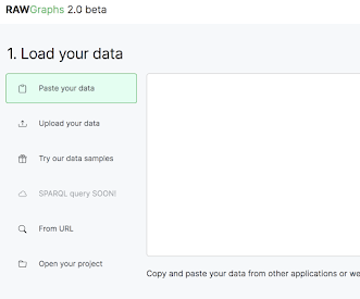
To create the chart, you go to RawGraphs 2.0 and choose "Try our data samples" and choose Instruments of the Orchestra...
and you'll get this...

You can play with the data if you prefer to analyze only one kind of orchestra or section or instrument. I stayed with the whole set and then chose Alluvial Diagram as my chart...

Then I mapped the data by choosing Group/Instrument and then Number (of instruments)...

and that generated this chart...

The chart is interactive and, when you hold down the cursor,
it shows how many instruments are in that particular section.
I think it would be a fun exercise for kids to think about an instrument in terms of its importance to the whole orchestral sound, to think about quality of sound, range, tone, timbre and come up with different orchestras with unusual groupings and ratios and to use manipulation of the dataset to produce a new chart. Then, to take it further, imagine themselves as an instrument and what their esthetic contribution would be to the group and to the musical sound.
~ J

Comments
Post a Comment